
“All theory, dear friend, is gray, but the golden tree of life springs ever green” – Johann Wolfgang von Goethe
Last week we had the pleasure of welcoming both artists and art enthusiasts alike to the opening of our latest exhibition here at Beside the Wave, ‘The Colour Green’. Not only did the opening quite aptly mark the official start of springtime and the subsequent changing of the seasons, but we have also been fortunate that this too has coincided with the return of the sunshine and warmth here in Cornwall.
Our artists were entrusted with the simple brief of producing works that fell under the hypernym ‘The Colour Green’. This has enabled the artists to use their creative freedom and own interpretations of what this secondary colour, sitting halfway between blue and yellow on the colour wheel, means to them.
On a broader scale, the colour green has a diverse array of connotations among respective cultures, countries, and continents. In Eastern Asia, an intrinsic value is given to the meaning of different colours; the Japanese perceive green to signify eternal life and vitality, every year celebrating ‘Greenery Day’ on the 29th of April in honour of the Emperor Shōwa, who held a strong affinity to nature. Similarly, going back through the centuries, in Ancient Egypt each colour had its own particular symbolism, green having long withstanding denotations of happiness, health and rebirth, associated with the dying and reviving God Osiris.
In a society eager to attach meaning to words and ideas, the aforementioned connotations are not dissimilar to the colour green’s associations in Western culture today. Speaking to those around me, I asked what the colour green means to them. A particular semantic field became evident from the likes of the words ‘nature’, ‘the natural world’, ‘growth’, ‘renewal’, ‘new beginnings’, ‘abundance’, peace’, ‘harmony’ and ‘serenity’. The colour green seemingly evokes positive responses, suggesting a sense of optimism and opportunity that prevails, therefore unsurprising why it has long-been such an abundant colour among artists.
As I take a walk through the gallery, it is clear how each one of the talented artists who have produced works for our springtime collection skilfully give the colour green its own sense of identity, paying homage to universal assumptions of the colour as well as to their own unique styles, techniques, and memories.
Our window display is the perfect space to capture the attention of both keen art collectors and leisurely wanderers, and with the arrival of the new exhibition, Luke has carefully set the scene, with a handmade wooden sign, barks, and fresh heather, reminiscent of the local Cornish coastal paths. And who better an artist to occupy this space than Catherine Lucktaylor, whose works we have the privilege of exclusively showing here at Beside the Wave. Catherine’s two ceramic collections, ‘Wild Cornwall’, which embody the wild spring beauty of the Cornish landscape, and ‘Sea & Cliffs’, inspired by the land and sea of far West Cornwall, encapsulate the natural elements of this time of year in Cornwall, whilst also having a very personal touch, each pot hand-painted, smoothed down with Catherine’s ‘favourite’ pebble, and then fired in her handmade Raku kiln. Unsurprisingly, Catherine’s works have already shown immense popularity in the gallery!

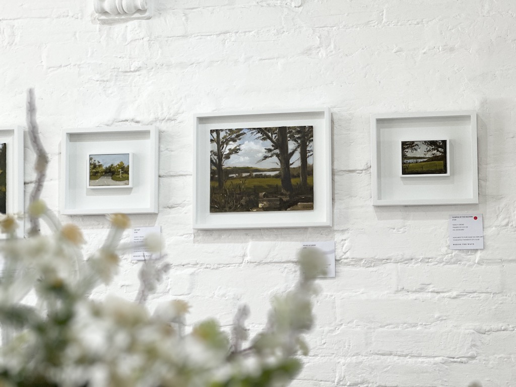
Hanging just above the ceramic display are Nancy Crewe’s glorious canvas acrylic paintings, ‘Camping at Trevedra’ and ‘Tregew Daffs’, which focus on the ever-changing skies over the local Cornish landscapes. Nancy, who wholeheartedly embraced the brief, both in her artwork and in her choice of clothing for the opening, adorned in different shades of the colour green, produced a whole host of works for the collection, varying in size, style, and subject. Nancy’s craftsmanship and versatility as an artist is apparent when strolling through the gallery, from still life works of primulas, pears, and daffodils to landscapes of scenic paths which take us on a snapshot journey from Falmouth to the Helford along the Cornish coast. In conversation, Nancy tells Luke how she enjoyed not only seeking the colour green in the landscape, but also revealing the more subtle shades found within the home, reflecting on personal and emotional connections to colour and place.

Above the fireplace and opposite Nancy’s oil paintings is Sarah Wimperis’s springtime collection of stunning coastal and inland scenes of Cornwall, foregrounding nature in its abundance. Sarah is a plein air artist, and has predominantly used oils for this collection, though using a variety of brush strokes and mark making techniques to capture varying perspectives and subtleties within her work. We are fortunate enough to have one of Sarah’s original sketchbooks in the gallery, which is too available to own, and as I flick through it, I am astounded by the diverse array of depth and tone of colour she has utilised in her watercolour sketches, giving a real sense of diversity to the Cornish landscape through the seasons.

Before we turn the corner to the right-hand side of the gallery where Hugo Jones and Mary Mabbutt’s work lie, original works by Richard Tuff and Miles Heseltine that resonate with our current exhibition’s brief are also featured. Richard is known for his diverse range of painting skills, and this collection is no different. Blurring the line between abstract and realism, Richard’s gouache paintings encapsulate a certain essence of place whilst also transporting the viewer into a fantasy-like realm of tranquillity and simplicity.
Similarly, Miles creates an element of escapism in his works, his confident approach to painting and the spontaneous nature of his work nods to an embrace of a more contemporary, abstract style of painting. Currently on show at the gallery is his ‘Woodland’ collection, demonstrating the creative energy behind Miles’s works through his energetic mark making and vibrancy of colour and shade.
Facing out to sea, in front of the window, begins the work by Hugo Jones for ‘The Colour Green’ collection. Hugo has captured an array of scenes, from fishes and boats to pastoral fields and moors with his smaller oil paintings on paper and, spanning around the back side of the gallery, larger oil on board works of the rural landscape, of hay making and gentle fields. Hugo’s work demonstrates the changing of colours and the evolution of the landscape with the changing of the seasons, serving as a reminder of warmer afternoons and lighter evenings that ensue.
Drawing to a close the paintings in this exhibition, we have Mary Mabbutt’s unique still life works. Working in both small and larger scale, Mary has painted a series of ‘Studio Study’ works for the collection, smaller pieces, each subtly unique in shade and form, as well as larger still life oil paintings of flowers: snowdrops, pussy willows, and hellebore. Mary takes influence from her everyday surroundings and these particular paintings respond to common associations of the colour green with the coming of spring, the natural world, and the emergence of new life.

Finally, sitting below Sarah Wimperis’s waterside oil paintings, and alongside her original sketchbook are Emily Doran’s impressive coastal ceramics. We are fortunate to exhibit a range of Emily’s ceramics in the gallery, from bottle, tall and bud vases and planters to short and tall mugs, small and large jugs and bowls which are all individually dipped in buckets of unique hand-made glazes. Emily’s ceramics are inspired by a love of the coast and sea, and as such, the different glazes are named after the seascape they evoke. The particular collection on display as part of ‘The Colour Green’ exhibition are the misty lagoon and calm waters glazed ceramics, whereby Emily has used the subtlety of shade to reflect the changing weather conditions, playing on the emotional response they provoke.
As I sit back down, reflecting on the contributions to our latest exhibition, I believe it is clear how the colour green evokes different ideas, memories, and experiences for each of the respective artists. Yet, there is a sense of a collective solidarity when viewing the collection as a whole; this is a collection of optimism, of new beginnings, peace, and abundance, duly bringing us out of the depths of winter and into the blossoming of the spring season.
We can’t wait to welcome you to the gallery to come and enjoy ‘The Colour Green’ collection with us and soak up the start of what we hope will be a long, glorious spring-summer here by the coast.
Find us at 8-10 Arwenack Street, Falmouth or view the collection online at beside-the-wave.co.uk.
Words by Mimi Hadley-Piggin